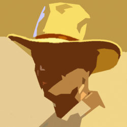
 The colours on my palette.
This is the list of the colours that I have on my palette. I am very satisfied with Rembrandt of the dutch brand Talens. Good professional quality. And as I am dutch myself I am proud of this excellent product. The numbers on the list refer to the colour chart of Talens. See here the PDF of the Talens colour chart.
Some notes on the colours.
- White: I occasionally mix zinc and titanium white. It makes a soft, runny white.
- Lemon yellow: I don´t need it so often but it makes a marvelous combination with white and carmine. Good for the cheeks.
- Yellow ochre: One of my basics to make skin tones.
- Raw siena: Not always on my palette but sometimes useful in receding planes on the forehead. Also mixed with cerulean a nice combination for back-grounds
- Cadmium red light: Together with yellow ochre a basic for skin tones.
- Cadmium red deep: A cooler red, nice for blush on the cheeks.
- Cadmium orange: Mixing with viridian green makes a rich, deep shadow.
- Venetian red: Sometimes useful for the lips, mixed with white.
- Indian red: Also sometimes for the lips. And good for making flesh tones for a darker skin complexion.
- Burnt sienna: Useful for shadows with viridian green. With ultramarine makes it an almost black. With ivory black useful for black-brown hair.
- Burnt umber: Don´t mix this with the lights. Useful for deep accents, but almost pure from the tube.
- Carmine: Indispensable but take care: it is very high-keye. Mix with ultramarine and white for a mauve-colour. Useful to cool down fiery skin tones. With white: perfect highlight.
- Permanent yellow-green: A bright green colour. Useful for sun-tanned skin and sometimes in the face on the temple.
- Chromium oxide green: A solid green for making a rich brown shadow with cadmium red light.
- Viridian: Perfect dark colour to start making shadows.
- Cerulean blue: Appropriate for cooling down fiery flesh tones.
- Ultramarine: With burnt sienna a good black. With carmine and white makes a mauvish mixture.
- Ivory black. Nice to make neutral grey´s with white and yellow ochre. With burnt sienna for good deep darks in black hair. Never use black why you need black! I mean for instance in black cloths.
Hello Ben,
I just purchased your video demo. And I was wondering if you have the painting called Clara of it’s demo available? I appreciate your work very much. Thank you!
Best regards,
Serena
Hello Serena. The video you have purchased is the only in-depth tutorial I have until now. Within month my second will be available.
Kind regards.
Ben