
Ten common mistakes in portrait painting.
This is the first of a series of 10 blog-posts, in which I will discuss ten of the most common pitfalls in portrait painting. I will publish every fortnight on each topic.
- Photography
- Canvas
- Brushes
- Paint & medium
- Flesh tones
- Fear of shadows
- Control of contrasts
- Detailed or blurry?
- When to stop
- Aftercare
So, today: About photography
Many artists work from photography and I’ve said before that I have no objection whatsoever to doing so. It is true that I want to stimulate as much as possible to work from a live model because that is really what it’s about. Developing drawing skills is the most fundamental element of classical art.
Often, the photograph from which one wants to paint is of poor quality, giving poor recording and often a worse impression. Remember that from a bad picture it is hard to paint a good portrait. This is far too easily overlooked. Something like: “My print is far too yellowish, I will make it more red”. I know that is very difficult especially for a beginner.
There are some points to which you should pay attention:
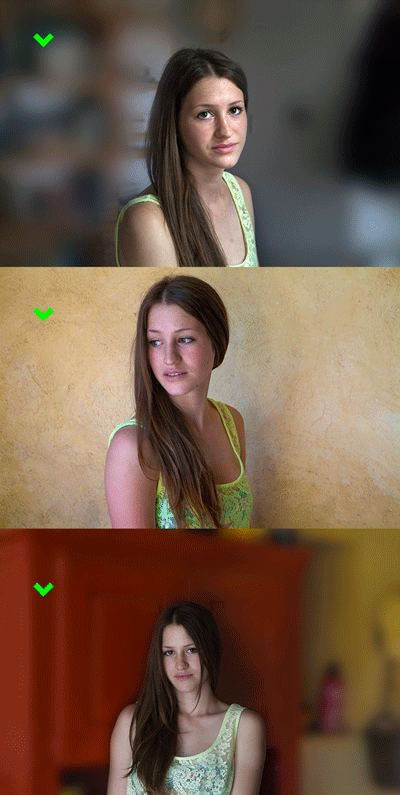
- Make sure the model is well illuminated, whether it is artificial light or daylight. I prefer three-quarters of the face to be in the light, and a quarter in the shadow. Avoid flash photos because flash eliminates all useful shadows and it is these shadows that you really need to portray the face.
- If your camera has the option of RAW, then use it. Now, when you open the file in Photoshop this option gives the most possibilities to adjust the dark / light ratio, and colour balance. Some skills with dealing Photoshop are handy but you really don´t have to be expert.
- I print the photos from my own printer, making a number of test-prints of a small part of the copy until colour and tone are good. Then I print the entire picture. The quality of the printing paper is very important. I use the highest quality high gloss as it gives the most natural reproduction, particularly of flesh tones.
- When you opt for professional printing then order three versions: one that is of good exposure, one that is a little too dark and one that is too light. Doing so, you always have the option to use the shadows of the one and the lights of another print for reference.
See also: Contact with te model and photography.