Yesterday someone, who just bought my tutorial video, asked me to explain more about the use of medium and to clarify the issue of warm/cold contrast. Also he asked what colors are transparent and what colors are opaque. I will come back later more elaborate in a special post in my Tips & Tricks section. But already I will give a short comment.
Medium: I usually start without any medium. (sometimes in the background I may start using citrus turpentine to give a thin wash, almost like watercolour) Later, if necessary, I use a neutral drying medium, and in the end when the canvas is already covered with paint I might add stand oil to the neutral medium. But remember FAT over LEAN. Never have a very oily start e.g. with linseed oil. White spirit or turpentine is lean. Thus in this sequence:
- White spirit
- Neutral drying medium.
- Linseed oil, stand oil.
(Later I will comment on quick and slow drying medium)
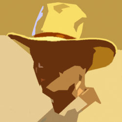
About the warm/cool contrast: It is not so easy to say what colour is cool and what is warm. For instance you cannot say that every blue is cold or every red is warm. Nevertheless this contrast is important in portrait painting. But to begin with a rule of thumb: Warm light produces cool shadows, cool light makes warm shadows. That means that the cool-warm contrast is also present in one and the same portrait. Usually portraits with indoor daylight lighting has the cool-light >< warm-shadow contrast. In that condition shadows are warm and the basic color for this shadow is often burnt sienna. The high-lights wil have a white+crimson combination. See also this page.

Transparent/Opaque: Most brands show this on the tube. See for example the colour cart of Rembrandt-Talens.
Mooie bruiloft was het!
Lisette