Almost 10 years ago I painted in oil the portrait of our daughter when she was 18 years old. The watercolour painting is made some ten years earlier. End of next week we will celebrate her wedding in Madrid.
I am glad that I painted some portraits of her. I never think in terms of eternity and I don’t consider my work so important that everyone will have to remember me after hundred years. But these portraits are different to me. You will understand.
In a painting there are active and passive zones. Let me explain that. In my portraits almost always I want to draw the maximum attention to the eyes. So I try to make that zone the most active place in the painting. How? Among others by creating the highest possiblearticulation of the highlights on the eyes. The mouth is the second in this order of attention. It is clear that the the background is the most passive zone of the portrait. But you will have to pay the same attention to all the parts of the painting. The active as well as the passive. Every part deserves the same attention.
I am painting here the neck and this is not a very active part of the portrait. Nevertheless it has to be well painted. Good colours and good brushwork. And why do I say that? I want to stress that no part of the painting may become a bungled piece of work.
You should seek for the highest dedication to all areas. Passive and active.
At this moment I am really busy to do the voice-over for my video demonstration.
Still from the video.
Last week I showed you a picture of myself behind the microphone. The video will have 14 chapters and now I am working on part 9. This is a short fragment of the text that I made for the part when I am cleaning once more a part of my palette:
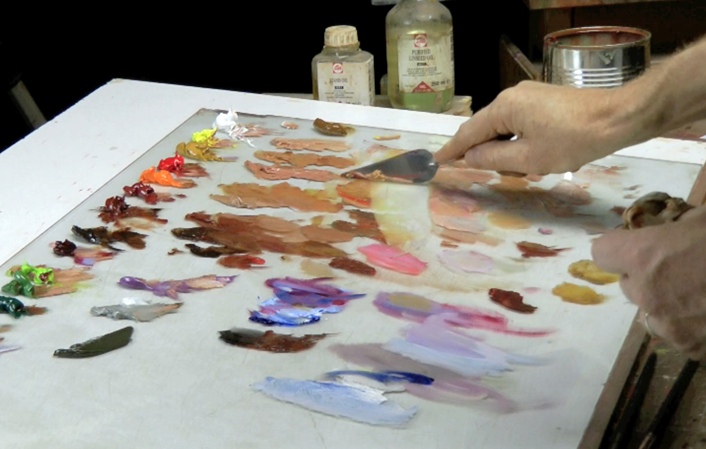
…but let me clean a bit my palette first before I carry on with the cheekbone. It may seem excessive to clean the palette every now and then. Sometimes I see students jammed in a terrible mess hoping to find their way out. I know that they might be afraid to lose all the mixtures by cleaning. But I think that a pure spot on your palette is much more effective than the possible convenience of recycling a left mixture.
The same error is: using different brushes for different colours. In one of my courses I saw a lady with six different brushes in one hand. I think that is a mistake. That does not help you. I am pretty sure that chaos on your palette and in your hand is the reflection of a chaos in your head. But please do not despair, to be honest I also was the one with that rubbish heap on his palette and with a bouquet of brushes in his hand. Long time ago!
I am still working hard on my second video demonstration on portrait painting.
Editing the second video demonstration.
Here I am doing the voice-over. Again in English. I hope it is possible to make the subtitles in Spanish as well. If everything works well I can offer the video in three options: English spoken and English spoken with Spanish subtitles. Also the version in English with English subtitels because I was asked for by a deaf student.
I still need about a month. In august I have to leave Spain for England to do a portrait commission and I don´t think the video will be finished before the trip.
Yesterday someone, who just bought my tutorial video, asked me to explain more about the use of medium and to clarify the issue of warm/cold contrast. Also he asked what colors are transparent and what colors are opaque. I will come back later more elaborate in a special post in my Tips & Tricks section. But already I will give a short comment.
Medium: I usually start without any medium. (sometimes in the background I may start using citrus turpentine to give a thin wash, almost like watercolour) Later, if necessary, I use a neutral drying medium, and in the end when the canvas is already covered with paint I might add stand oil to the neutral medium. But remember FAT over LEAN. Never have a very oily start e.g. with linseed oil. White spirit or turpentine is lean. Thus in this sequence:
White spirit
Neutral drying medium.
Linseed oil, stand oil.
(Later I will comment on quick and slow drying medium)
About the warm/cool contrast: It is not so easy to say what colour is cool and what is warm. For instance you cannot say that every blue is cold or every red is warm. Nevertheless this contrast is important in portrait painting. But to begin with a rule of thumb: Warm light produces cool shadows, cool light makes warm shadows.That means that the cool-warm contrast is also present in one and the same portrait. Usually portraits with indoor daylight lighting has the cool-light >< warm-shadow contrast. In that condition shadows are warm and the basic color for this shadow is often burnt sienna. The high-lights wil have a white+crimson combination. See also this page.
Long time ago I bought a second hand copy of the book Creative Illustration by Andrew Loomis. A spanish version that I could lay my hands on in the Reina Sofia Museum in Madrid. I knew the book from a friend. Long time this book has been my bible, still I look through it once and a while. Excellent explanations on how to draw, how to make a good compositions etc etc. Now this book and some more titles are available in PDF. For free!
As you may have seen my tutorial Portrait of a little boy was available in the shop-page. I was not happy with the option “90 days rent”. So I had to make a decision. In the end I moved to another seller company. Now my video is located at Flickrocket and people can see the video unlimited.
Portrait of a little boy.
I am sorry for the increase of the price but I had no other option. Still it is cheap I think.
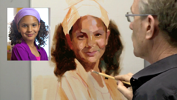
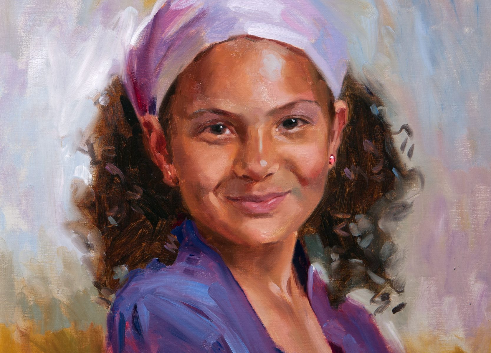
Last Friday I finished the portrait of this little girl for my next video tutorial. All the footage has been completed. Hopefully the editing will be finished before I leave for my summer courses in France next month. I’d better roll up my sleeves and get busy!
Portrait of a little girl. Click two times to enlarge.
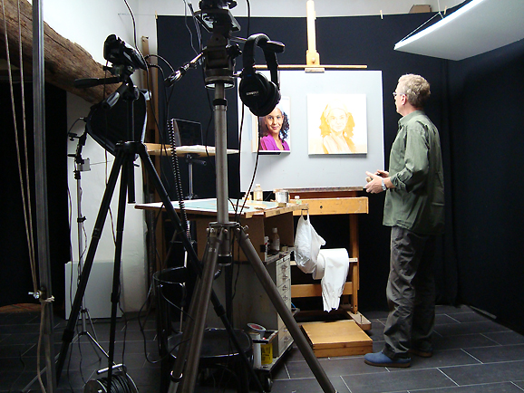
Today I started my new tutorial portrait of a little girl video. My painter-studio is now turned into a movie studio. A couple of days of high concentrated work on both: painting the portrait and capturing on video. A devilish task. Followed by two month of editing.
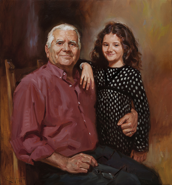
Sometimes you do not want to say goodbye to a portrait. Therefore, it took a long time before I could deliver this painting. But eventually all work has to leave the studio. That´s life.
I added this post on 9 may 2012. The portrait was delivered on the 10th. The grandfather was really proud and the same evening he called his friends to invite them to see the painting. The next morning the poor man died. What a tragic message!