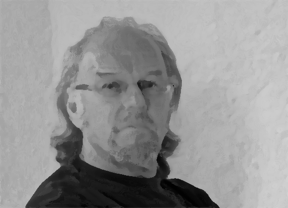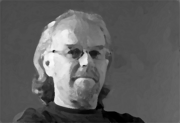
Chiaroscuro is about the dark/light ratio. That is to say the difference of values in simple, almost abstract planes. In general you can say that the stronger the chiaroscuro the fewer problems you encounter with the colour contrast. A lot of information is available on the internet. Here I give some examples.


But what has this to do with portrait painting? Below: Same model, different lighting. Which one is easier to paint?