Traps in portrait painting based on photography

Traps in portrait painting based on photography

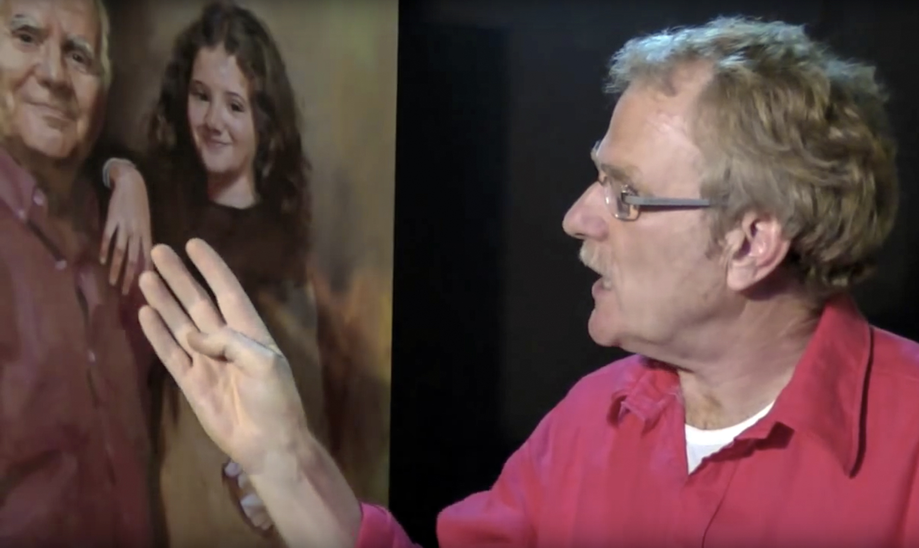
I’m often criticized because I explain how to paint a portrait from photography. Working from life is the only true religion, I always hear. I never answer because I know how things are in my profession. I say it again loud and clear: almost all my colleagues use photography when it comes to a commission. Only, they would rather keep silence in public. Anyway, I do not want to talk about that.

What’s one of the hazards of working from photography?


Traps in portrait painting based on photography
Portrait O Samuel, from life.

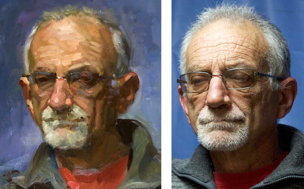
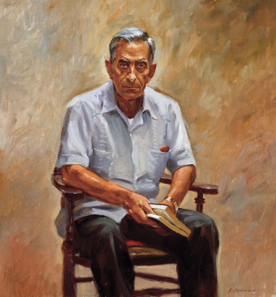
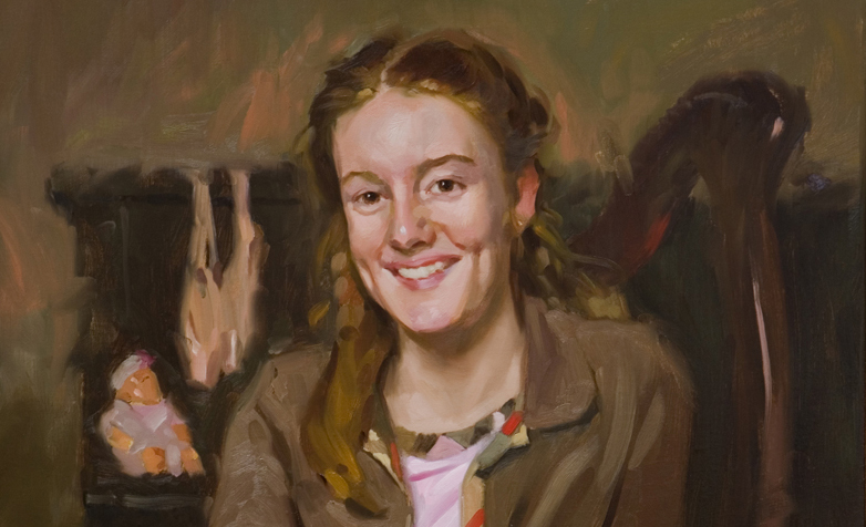
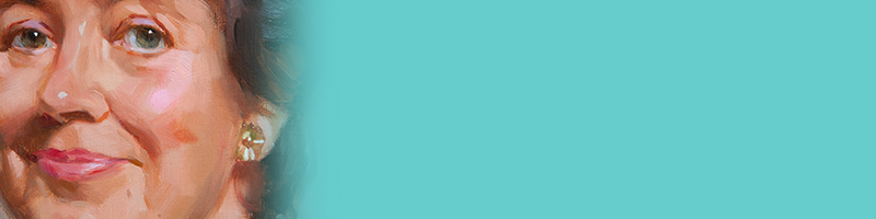
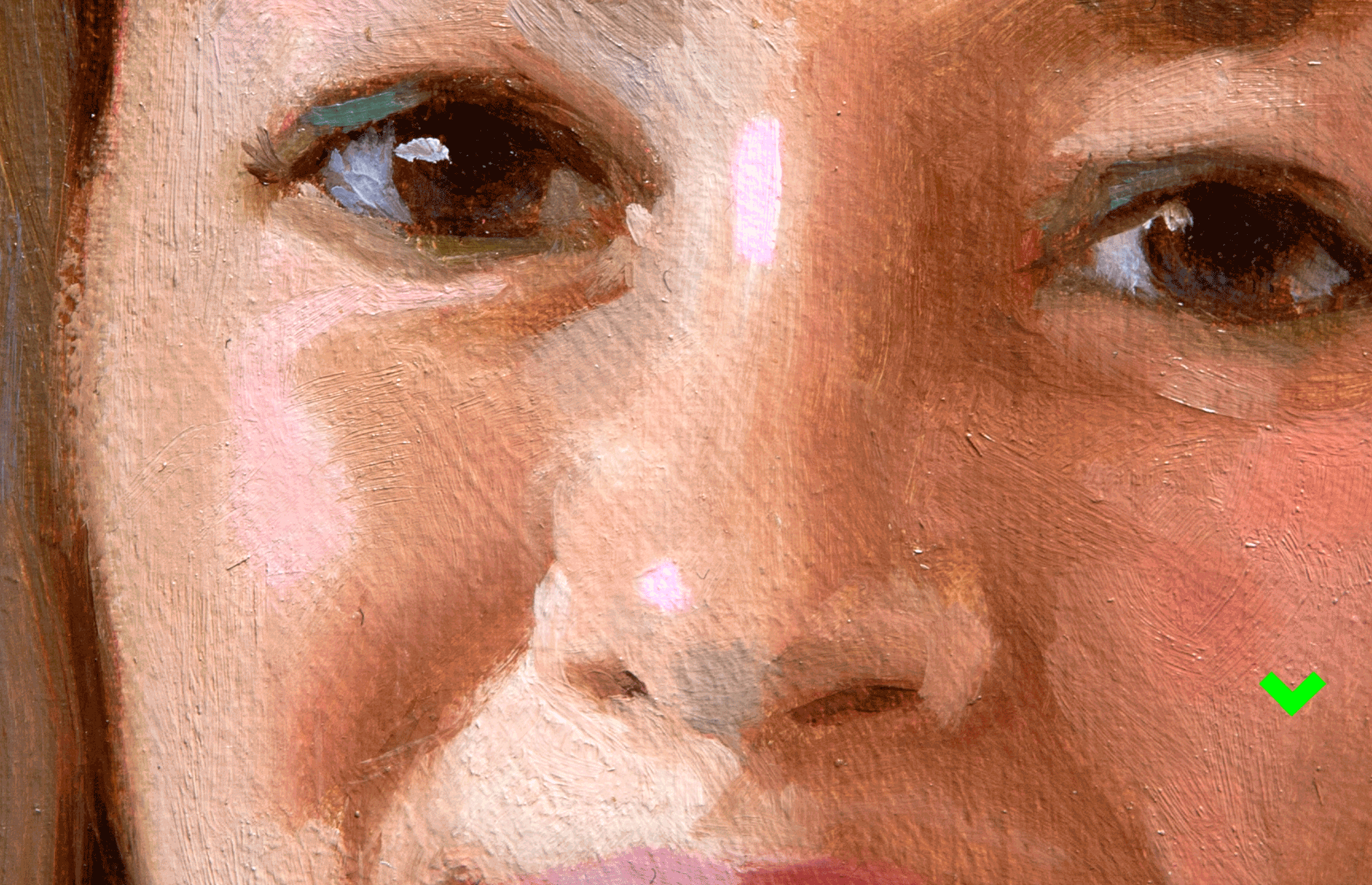
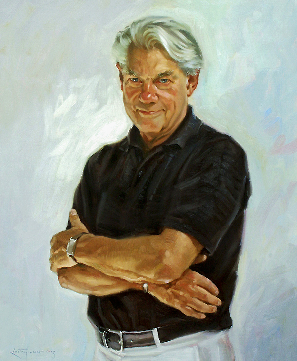
The exposure. The lefthand picture shows a portrait that I painted from life in my studio during our Tuesday sessions. I always take a picture of the model before we stop. That shot you see on the right. A major handicap in photography can be seen at a glance. The light-dark contrast is too big. In particular, the light parts suffer from the loss of the subtle nuances. I notice in my classes that many people overlook that phenomenon. So make sure that the print that you’re working from is not too light and that there is difference between the light and the high-lights.

Finally: of course work from life. Study as much as possible with a live model in front of you. The more training in direct perception the more your work from photography improves.

More posts on working from photography:

Work from photography.

Contact with the model.

More about photography.


More posts on painting from life model:

My favorite model.

Demonstration.

Power of perception.


Detailed or blurry

Detailed or blurry

Detailed or blurry
Portrait painting from photography has pros and cons. One of the major drawbacks is the inclination to copy all the details. Detailed or blurry?Apparently every wrinkle, eyelash and hair lock must be displayed faithfully. But a good portrait is not a sum of all observable details. I have said it last week: It’s not about whether it just seems real, the point is that it is true and authentic.

In his book Alla Prima ll Richard Schmid says:” In my view, detail for its own sake is a shallow goal, because I don´t think art is about how much stuff I can depict” Continue reading “Detailed or blurry”

Cool-warm contrast in portrait painting

Cool-warm contrast in portrait painting

Cool warm contrast portrait painting.

In portrait painting you have to deal with a number of contrasts. One is the cool-warm contrast. And I know from experience that people often struggle with this topic. The light-dark contrast is no problem to many students.

Cool-warm contrast in portrait paintingA basic principle is the often applicable rule:

This time a sad message

The portrait below is of Kees Thijssen. Last week he died. He was my agent for more than 25 years when I was working as an illustrator.

Keest Thijssen
Kees Thijssen 1933-2016

I was about 25 years old when I went to Amsterdam with my portfolio to find an agent. There were three major illustration agencies at the time in Holland: Art Connection, Top Drawers and Art Box. For some reason I could only visit Art Box. There I met Kees. He looked intently through my portfolio. He was excited: the next day I received a first commission! And the week after two, months later a dozen and, over the years, hundreds and hundreds. We became close friends.

Continue reading “This time a sad message”