
‘What do you do with the background in a portrait painting?’ I hear this question often. The answer varies. I usually base it on what I see in the room. The colour of the surroundings, the wall, a cupboard, a curtain; I use the colours but sometimes blur the objects. What I often do is repeat some of the hues of the face into the background. This portrait shows the “echo trick” clearly. See also this post.
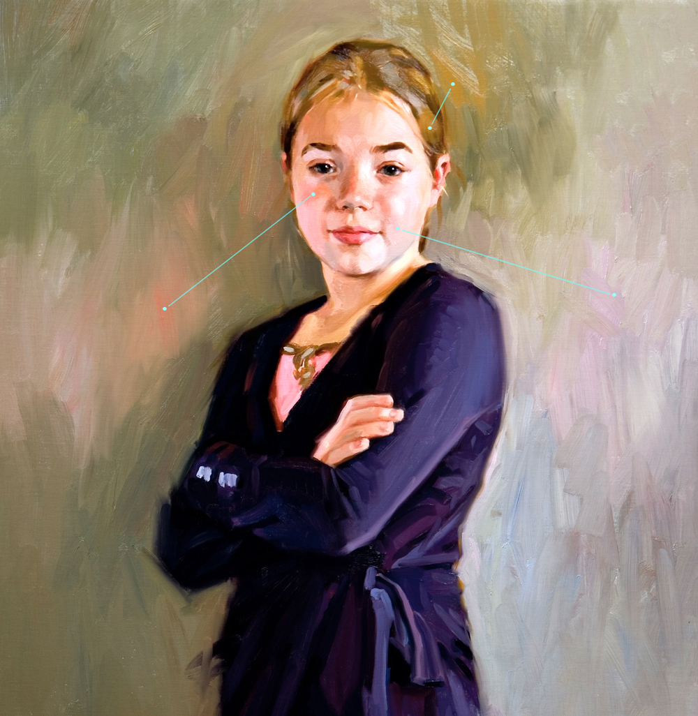
Why is this solution sometimes so effective? Colour balance has to do with mutual relationship. Usually I explain it this way: My colour scheme is based on colours that are members of the same family.