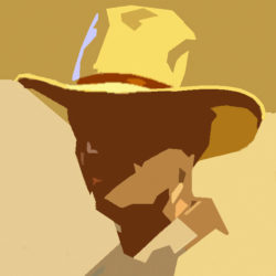

Cool warm contrast portrait painting.
In portrait painting you have to deal with a number of contrasts. One is the cool-warm contrast. And I know from experience that people often struggle with this topic. The light-dark contrast is no problem to many students.
 A basic principle is the often applicable rule:
- light parts are cool,
- shadows are warm,
- deep shadows are hot.
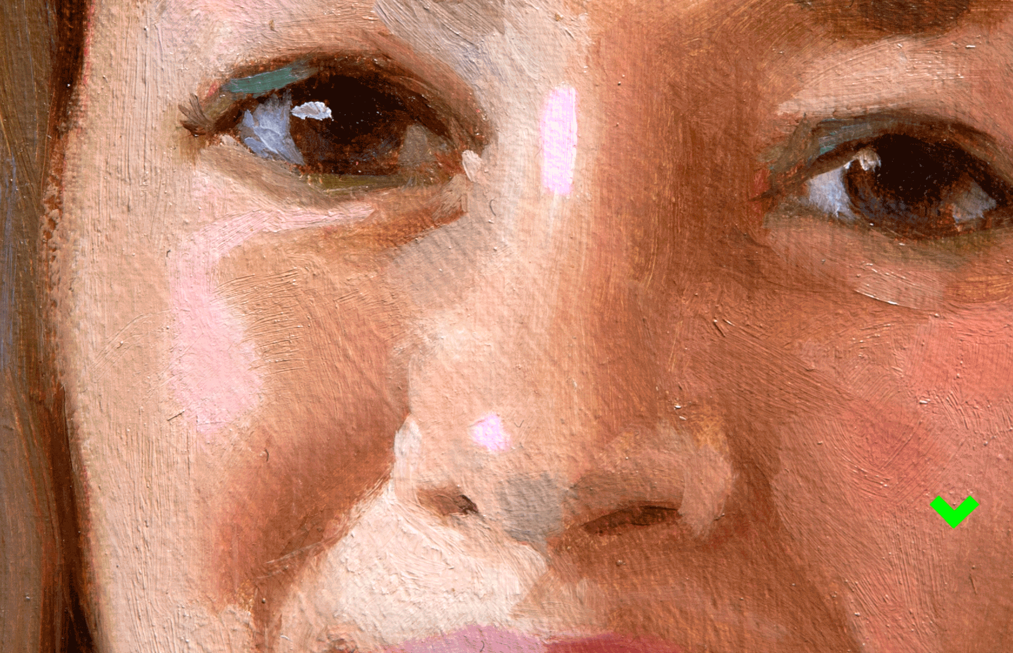
The light part of the face has often a cooler temperature than the shadow. And in particular in the high lights, this statement is of interest. Look carefully at the image. The highlights are not a lighter version of the surrounding flesh colours. No, they have their own, cool character. Less Yellow and more Crimson. This small difference can enliven a portrait in a refreshing manner.
(To explain this topic I had to exaggerate the effect in the image)
See also this article.
Hi Ben,
When working from a photograph that has been taken with a flash, are the cool/warm contrasts still there in the flesh or do you have to exaggerate/invent the cool/warm tones to some extent?. Happy Easter – Sam
Hi Sam.
I would say you always should invent colors. Usual the flash gives a cool light. But another thing: try to avoid flash pictures as it blows away all the shadows. And it is in the shadow where the power of a portrait is. A portrait needs shadow! Happy Easter.
Ben