Troubleshooting: the likeness (2)

Troubleshooting- the likeness (2)

2 Use a mirror

Working for long periods of time on a portrait without a break can be tricky. First, unwittingly, you become tired. In the beginning you make key decisions, but after a while your concentration certainly decreases. Secondly, the portrait resembles more and more itself: namely the image that has been built up in your mind. It is therefore important that your perception remains fresh. Take a little break every so often. A great tool here also is the use of a mirror. Hold the mirror in such a position that you see simultaneously your model (or photo) and your canvas. You will be very surprised what you see: the same image but completely different.

Using a mirror.The same image but completely different.
Using a mirror. The same image but completely different.

See me in this video using the mirror. 3:38

The annoying visitor

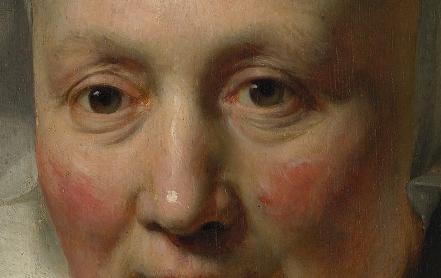
Did you ever notice this, when visiting a museum? Most people look at paintings from faraway. However, a single person is at a distance of a few centimeters to his eyes from a painting. Often this guy is warned by the museum guard: “Please back off.” This chap is definitely a painter himself. I know this because I do the same. I need to examine the painting technique: I want to see brushstrokes, feel the varnish, detect what kind of canvas the artist uses, at the borders sometimes some grounding is visible. I want to discover the secrets. Basically I am anxious to catch a glimpse of the Masters kitchen. People like me always stand in the way. We belong to that special breed among museum frequenters: the annoying visitor. For people like us it’s great that many museums have put some of the highlights from their collection in high resolution on the internet. For example, have a look at this link of the Metropolitan Museum of Art.

Portrait of a Woman Rembrandt (Rembrandt van Rijn)
Portrait of a Woman
Rembrandt (Rembrandt van Rijn)
Rembrandt van Rijn. Portrait of a woman. Metropolitan Museum of Art.

I got the wrong end of the stick: colour contrast

In response to my blogpost dated 1 May of this year I received the following comment:

Hello Ben

A beautiful portrait, but I do not understand the remark about the red face and green background.  I would think that the effect is thereby enhanced. Greetings”

 Yvonne Welman

Complementary contrast/ analog contrast
< Original painting. Complementary contrast/ analog contrast. Photoshop version >.

This observation is of course correct. Indeed, the green enhances the reddish effect. Green against red is a complementary contrast. Well, I have altered the background of the original painting in photoshop. In this changed version red is now the dominant colour overall. The whole painting is thus getting a huge saturation of the red tones. I did not want that. That is what I meant when I wrote “To minimize the impact of the reddish face I surrounded it with a greenish background.” (By all means, in the original painting, I had already introduced some red accents in the background, as an echo of the reddish flesh tones, at the left of the face.)

Off to Holland

Tomorrow,  May 8,  off to Holland for a commission. Sorry, no post this week. Come back next week.

Off to Holland
Off to Holland

Not a lick and a promise


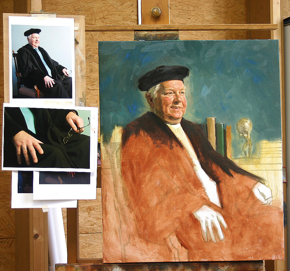
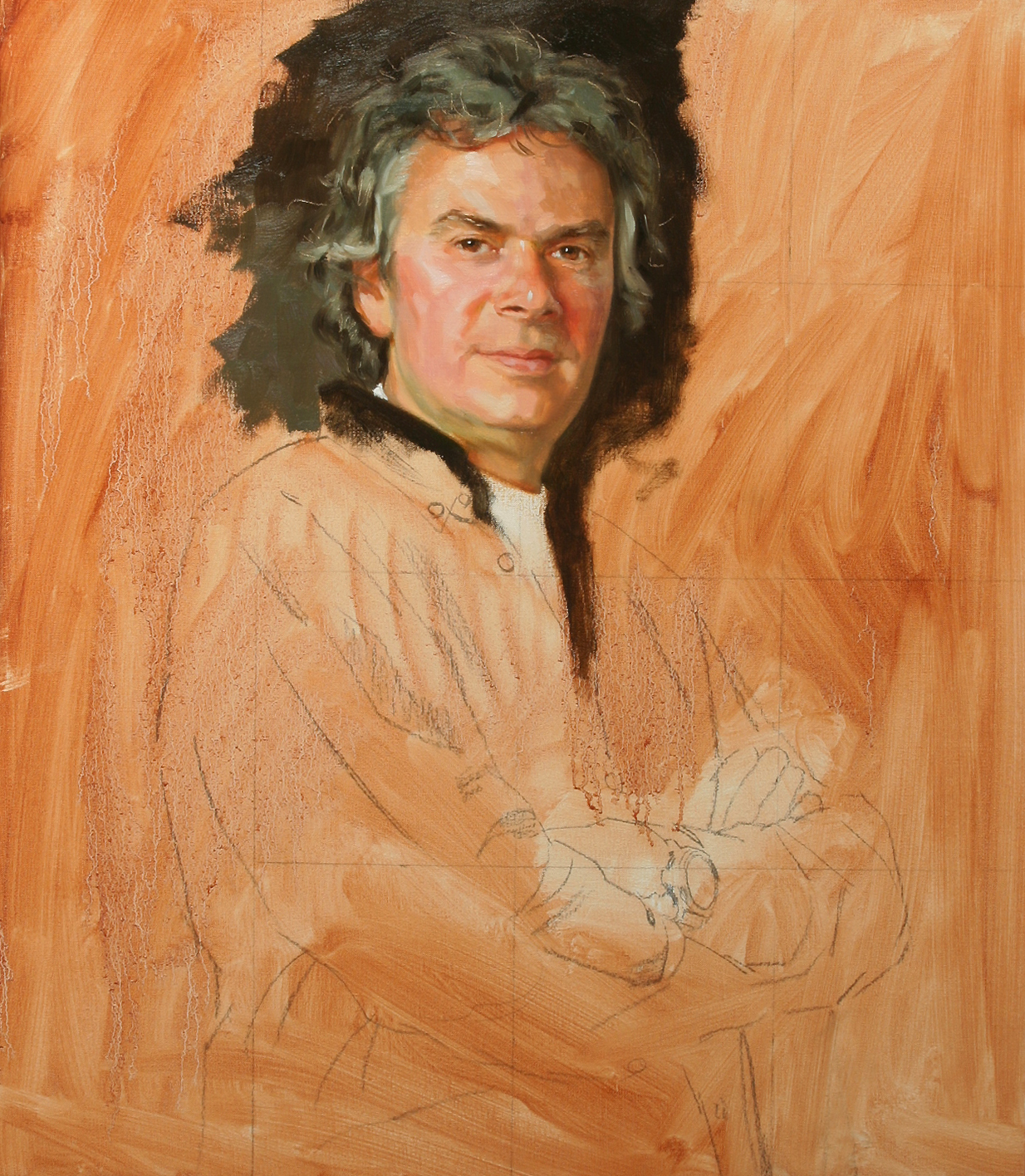
Professor, halfway painted 2006

I like to see half finished paintings, even of my own work. It says something about the work process. Was it the Dutch writer Cees Nooteboom who once said “Traveling is better than arriving”? I just found this image of a half painted portrait. Here you see: I am traveling. It is not finished; not yet  at my place of destination. Often I enjoy more of the process itself then the finished product.

Atlas
Atlas, click to enlarge

Also this picture reminds me of something else. I see the small statue in the background. It represents the Greek mythologic figure of Atlas who held up the celestial sphere. I added this prop at the special request of the sitter, the retiring Professor of Philosophy at Vrije Universiteit of Amsterdam. For lack of good reference material I made a sculpture in plastiline myself and painted it with acrylics to imitate the bronze patina. I really like to prepare things blow by blow. Not a lick and a promise.

Law unto yourself ?

Colour Theories
Theories

A long time ago I thought I needed to know absolutely everything about laws & rules on painting and especially on portrait painting. The more theoretical knowledge the better. For example regarding colours. I examined the Goethe’s and Itten´s colour theories. However I hardly understood a tenth of it. How often have I put away books to take them in hand yet again?  More than once I wondered whether book knowledge was really my ´peace of cake´. In fact, I developed an aversion to theories in general. Not really convenient of course if you want to become a professional artist. Sometimes my progress suffered from slowness. Now, after all these years, I have freed myself from the idea that a thorough theoretical knowledge is essential for a good start. I created my own rules and verities.   I failed my way to success.

Please listen to the attached video : Neil Gaiman’s commencement speech to the University of the arts graduating class of 2012 Philadelphia. A touching speech for making your own rules in art and ignore sometimes existing theories and dogma´s.

Below the written text of the speech.


Neil Gaiman’s commencement speech to the University of the arts graduating class of 2012 Philadelphia

I never really expected to find myself giving advice to people graduating from an establishment of higher education. I never graduated from any such establishment. I never even started at one. I escaped from school as soon as I could, when the prospect of four more years of enforced learning before I’d become the writer I wanted to be was stifling. Continue reading “Law unto yourself ?”

Value and colour, what is the problem?

You learn the most from your own mistakes, I’ve mentioned this before. “But how does that work?” you might ask. Sometimes you know that your painting is unsuccessful but you do not know why. In the beginning, that was also a problem for me. Perhaps the most important thing I taught myself is this: Make a checklist to be used after finishing a painting. (Applause from family and friends is trappy: It’s not hard to get compliments and believe that you’ve done an amazing job when you actually should know better.)

Some criteria that you can think of:

  • Is the composition solid enough?
  • Is the value contrast okay?
  • Is the use of colour okay?
  • Did I use enough paint?
  • Do I see enough “bold” brush strokes?
  • Not too many meticulous & irrelevant details?
    There are numerous points to invent. Later I’ll come back to this issue. Try to make such a list for yourself.

An important observation is this: Value contrast can be more important than colour contrast. When a painting is not really a hit because you got stuck in colours that don’t want to accomodate, remember that the solution perhaps lies in the value contrast.
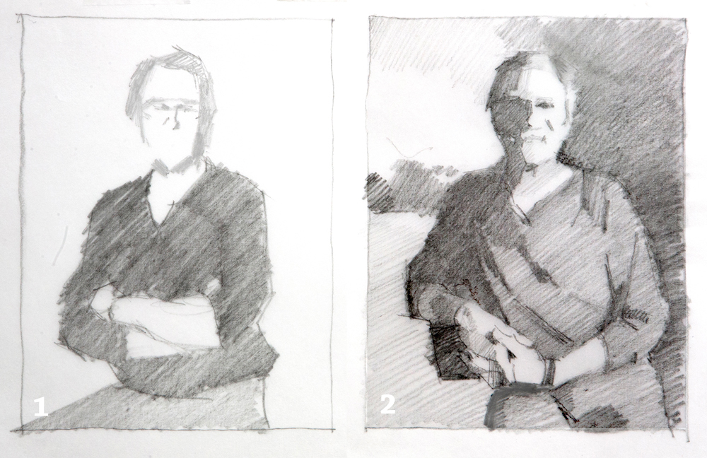
self portrait 2self portrait 1

chiaroscuro

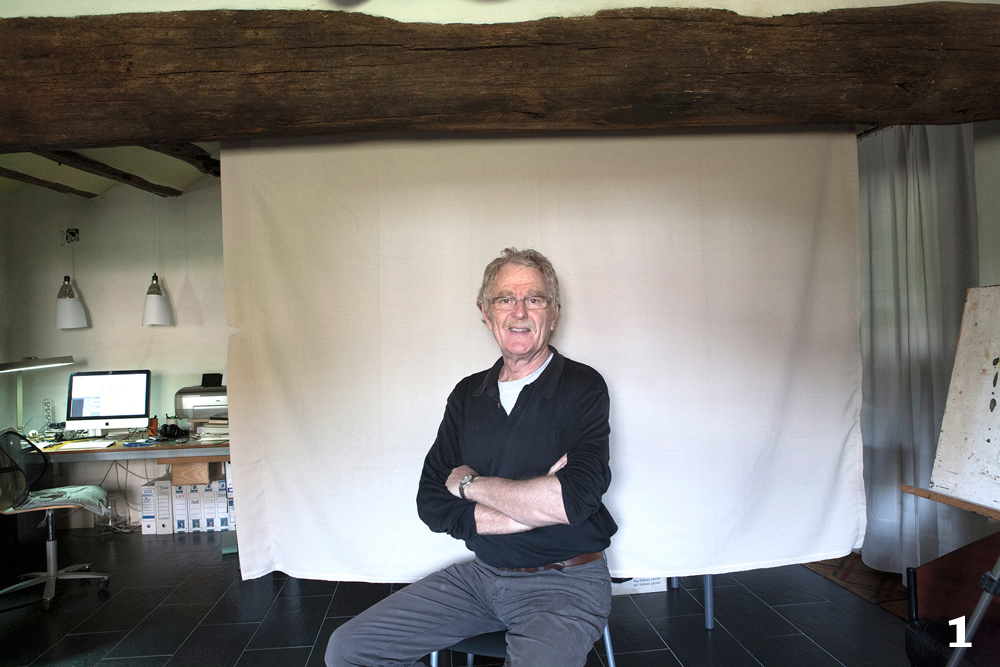
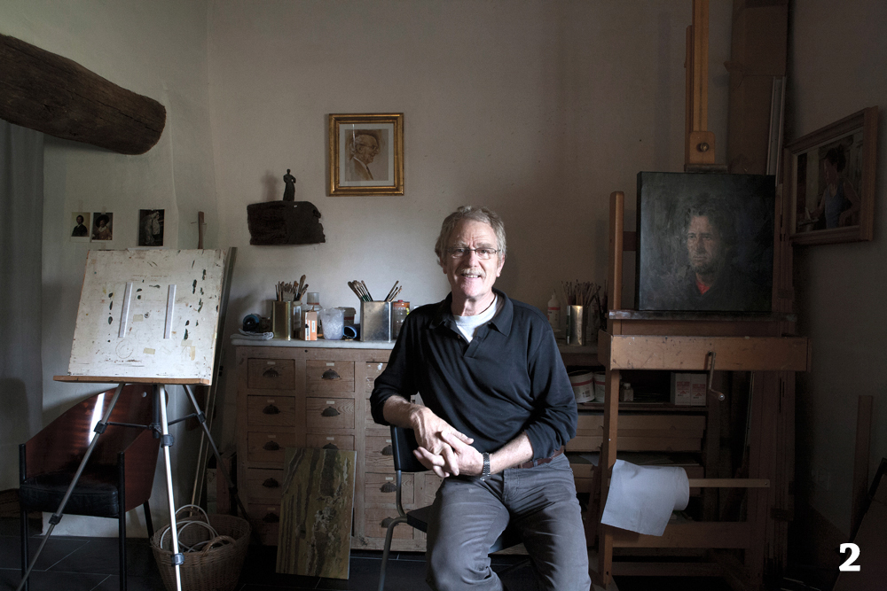
I made two images with the self-timer in my studio. On the first the light source is right in front of me. On the second from aside. I transformed the two into a simple grayscale drawing. In the first drawing the portrait has to come alive from subtle colour contrasts. In image 2, the face is completely formed by the strong shadow. Drawing 2 has a higher value contrast and that makes it much easier to achieve a strong portrait and to obtain a good likeness. See also this article.

A great guitarist, a big hitter

Will Sophie

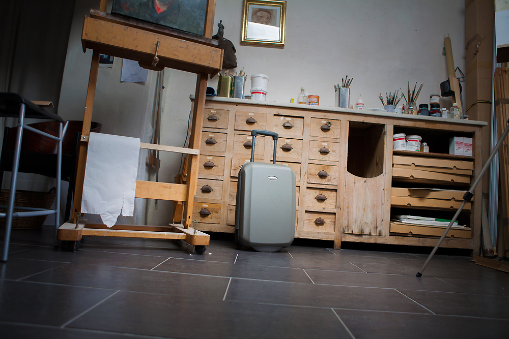
Two cousins in the studio


A month ago Will Sophie was visiting us in Spain. I’ve told you about him before. He plays guitar on some of my recent videos. We are cousins. We come from the same social background. He got into music and I started painting. Two different people with different characters. But we had things in common: we both had a dream, and we shared the inability to survive in a nine-to-five job. I did that until my early twenties, and Will not much longer. The choice for individual independence in our milieu was not very obvious. Which does not mean that our parents were not proud of what we did and achieved. On the contrary. (Behind my back my father gathered my discarded drawings and if something appeared in print he secretly made a small collection). Will has made an impressive career for himself, and I think he belongs to the Top Ten Dutch guitarists. I’m proud that he gave me permission to use his music. It adds so much luster to my videos.
Check out also his video channel.

When are you famous?

Portrait as used in publicity campaigns
The portrait halfway painted.

Years ago I received a commission for a portrait that would be used in a publicity campaign for a home-decoration company in the Netherlands. Thanks to my agent we agreed to good terms and the financial settlement was very satisfactory. However, I did not know exactly what role the portrait of the owner of the company would play in the campaign. It soon turned out that the picture appeared in countless advertisements and even on the trucks of the company. I was surprised, when I once was back in the Netherlands, to find myself driving past my portrait on the highway. Then I asked myself: am I already a little famous?

A commissioned portrait

In recent decades, almost exclusively I have been painting portraits on commission. Clients pay for the assignment, and that creates obligations for me, the artist. Principally, the portrait should have a perfect likeness. That’s fundamental, and rightly so. In addition, the painting must meet a number of criteria that has to do with the artist´s view. Firstly, of course one would depict the person in an flattering way. I once read somewhere : A portrait is not just painting a picture, it is the celebration of a person. That is what I am looking for. Regardless, the painting should be of good colour balance, chiaroscuro and composition. But all this, usually has nothing to do with the extent to which a portrait shows a detailed view. Sometimes I can also linger too much on details and I often think I should stop painting earlier. Seeing  the portrait of this young lady again  (that I made years ago) I remember I wondered if I should elaborate more some details. Now that I see it again, I still do not know. I like the overall unsharpness.

A commissioned portrait
Portrait of a young lady. Should I elaborate more ?