Value and colour, what is the problem?

You learn the most from your own mistakes, I’ve mentioned this before. “But how does that work?” you might ask. Sometimes you know that your painting is unsuccessful but you do not know why. In the beginning, that was also a problem for me. Perhaps the most important thing I taught myself is this: Make a checklist to be used after finishing a painting. (Applause from family and friends is trappy: It’s not hard to get compliments and believe that you’ve done an amazing job when you actually should know better.)

Some criteria that you can think of:

  • Is the composition solid enough?
  • Is the value contrast okay?
  • Is the use of colour okay?
  • Did I use enough paint?
  • Do I see enough “bold” brush strokes?
  • Not too many meticulous & irrelevant details?
    There are numerous points to invent. Later I’ll come back to this issue. Try to make such a list for yourself.

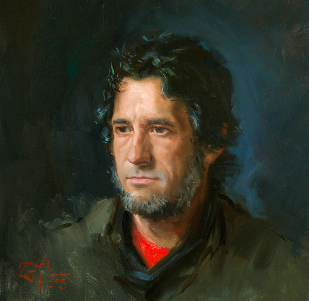
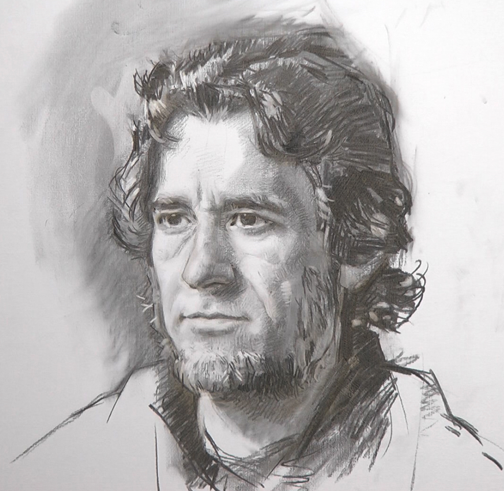
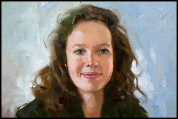
An important observation is this: Value contrast can be more important than colour contrast. When a painting is not really a hit because you got stuck in colours that don’t want to accomodate, remember that the solution perhaps lies in the value contrast.

self portrait 2self portrait 1

chiaroscuro

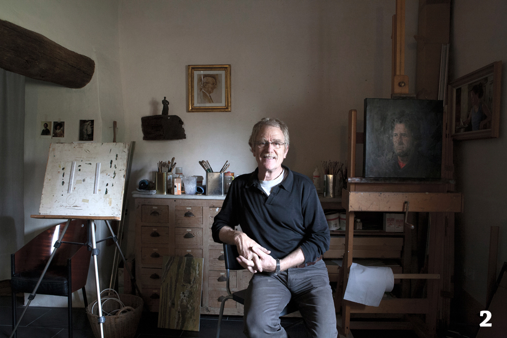
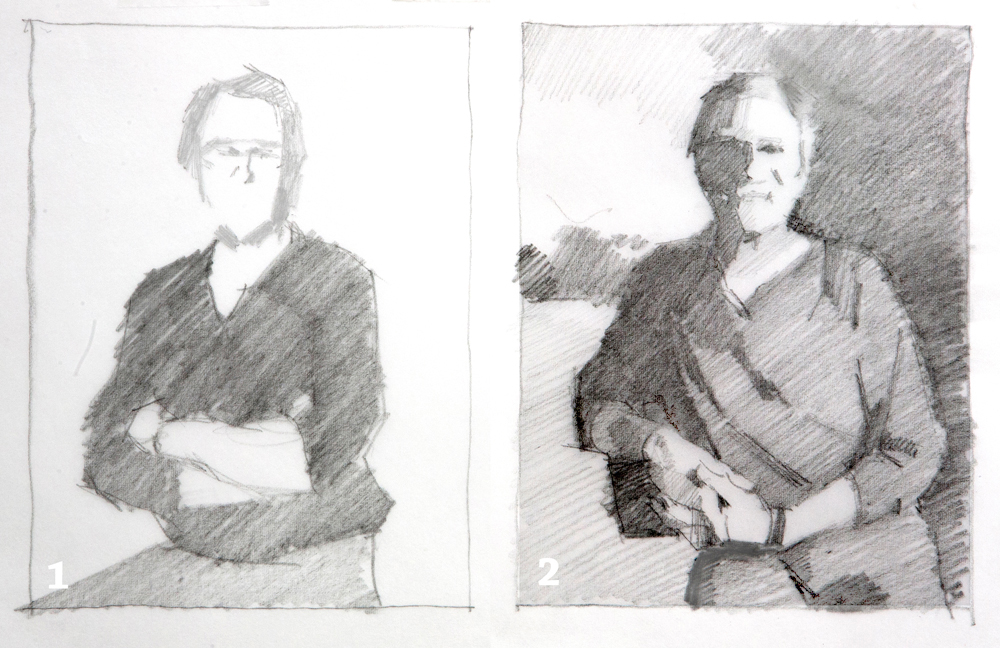
I made two images with the self-timer in my studio. On the first the light source is right in front of me. On the second from aside. I transformed the two into a simple grayscale drawing. In the first drawing the portrait has to come alive from subtle colour contrasts. In image 2, the face is completely formed by the strong shadow. Drawing 2 has a higher value contrast and that makes it much easier to achieve a strong portrait and to obtain a good likeness. See also this article.

Portrait painting from life.


Luis. 55 x 55 cm. oil on canvas
Luis. 55 x 55 cm. Oil on canvas.

For this demonstration, I used my customary, extensive palette of 16 colours. I premixed a limited number of flesh-tones. Three for the light parts, one for the shadow, three neutral grays and a mauve colour. Because I elaborated the drawing accurately, I could make use of the tonal values​​ of the charcoal. In the beginning I used citrus turpentine to dilute the paint. This approach enabled me to paint rather transparent to start with. In simple planes I started the painting and little by little I worked it out entirely. The whole session took seven hours over two days.

BUIGEN 2

Also you see me using my home made viewer or colour checker. Make one yourself.

Drawing from live model.

Yesterday and today we did the shooting for the video “How to transfer the drawing of a portrait onto the canvas”. My friend Luis was my model and he was sitting really good. I use charcoal in order to be able making corrections during the session. I thought of finishing the video next week but I will be off to London for a portrait commission. So it will take longer.

charcoal drawing for a painting Live model drawing

How to transfer a drawing onto the canvas

I am preparing a short video in which I explain four ways to transfer a drawing of a portrait onto the canvas. Three sections are finished and tomorrow we will start the shooting for: drawing from the observation of the live model. It will take some time to finish the final editing and the voice over but within a two weeks I hope I will able to show you the result. transfer a drawing onto the canvas

Drawing from memory

Some years ago, when I often travelled in the Valencian Metro, I had the habit of studying fellow passengers. I tried to remember how the head of a particular person looked like. At home I tried, from memory, to draw the head. Today I came across a sketchbook of that period with some of these doodles. I was reminded, that I had to be careful because people soon notice when you eye at them for a longer time. I am pretty sure I did at least sometimes and it must have looked strange.

schetsen

Once in a blue moon I had to draw from memory during the model-drawing lessons from Father Beatus Nijs, my unsurpassed art teacher. We had to observe the model for five minutes. Then we made the drawing from memory. A great experience! I did not preserved any of these drawings. Later I participated in more than one group to study nude models. There I proposed sometimes to do the same exercise. The drawing is from the 80s.

model-1

A commission to be delivered

This week I put the finishing touches to the portrait of this young lady.  A commission proceeded through my gallery in the Netherlands. For this occasion I show here also the pencil sketch. Such small, basic sketches I usually show to the client,  it is explicitly not meant to already judge the resemblance. The idea is that I like to show how I want to represent the model, and to clarify the cropping. Therefore I make this drawing in the most simple way possible. After all, I have a choice out of a variety of photos and the customer wants to know in advance how the portrait will look like. If I would make the drawing more detailed, it would distract from that intention. I am glad the client gave permission to show this portrait on my blog.

1

3jpg

IRIS


Some older work that I found

moeder ziek in bed+Angela 1966

I was cleaning up my studio and I found a couple of old drawings. In the sixties my mother had to stay in bed for about two month. She suffered from sciatica. Her bed was moved from her bedroom down stairs into the living room. From there she could give orders to her eight children. I made several studies of her when she was sleeping. In the corner below my little sister. I think I was 15 years old then.

moeder ziek in bed+Angela 1966
My mother in bed. 1966

This one is in pen with blue ink.