Portrait painting: Pamper yourself with good stuff!

good preparations for portrait painting
priming canvas
Apply at least three layers of gesso.

Suppose you want to learn to play the piano. The instrument on which you start is old, not in tune and with missing keys. Would that invite you to sit down and study? No! It will turn your stomach! The same goes for learning to paint. Poor art supplies will not encourage you to make a good painting. Believe me, good stuff really makes a difference! Starting with the canvas. A miserable support base is a principal stumbling block, I can´t stress it enough.

  • Whatever you buy, even the best double primed Belgian Linen, apply at least three layers of gesso in order to reduce the suction of the oils.
  • Use good brushes if you can afford it.
  • Buy good quality paint. Some brands of student quality is reasonable, but there is also a lot of crap on the market. Oil painting technique in itself is hard enough so do not let poor materials makes you stop before you even get started. (see also here)

Good stuff makes you happy!

Yesterday in London

Sargent in the Tate

I was in London this week for a portrait commission. There and back in two days. I hope to show you later some of this very interesting assignment. I visited the client in his office in the Millbank Tower.

Of course I did not miss the opportunity to enter the Tate, as it is next door after all. I went directly to the Singer Sargents. I admit it: I’m quite the monomaniac sometimes. I took some pictures and I include them here with some comments. I am safely back home now and return to work with new enthusiasm, kindled by our eternal hero John Singer Sargent.

Mrs. Robert Harrison by Singer Sargent
Poor Mrs. Robert Harrison, dazzlingly beautiful dressed in her red and white gown, hung too high to be admired in detail.
Mrs Carl Meyer. Singer Sargent, Tate Gallery London
Mrs. Carl Meyer, would she have complained about her mustache?
Mrs. Carl Meyer. by John Singer Sargent. Tate Gallery London.
Look closely at the necklace: clarity of expression!!
tate-3
Rule of thumb: lights are cool, shadows are warm, deep shadows are hot.

Colours in the background

colours in the background

‘What do you do with the background in a portrait painting?’  I hear this question often. The answer varies. I usually base it on what I see in the room. The colour of the surroundings, the wall, a cupboard, a curtain; I use the colours but sometimes blur the objects. What I often do is repeat some of the hues of the face into the background. This portrait shows the “echo trick” clearly. See also this post.

Colours in the background as an echo of hues in the face

Why is this solution sometimes so effective? Colour balance has to do with mutual relationship. Usually I explain it this way: My colour scheme is based on colours that are members of the same family.

Props in a portrait

props in a portrait

As you already know, I work almost exclusively on commission. It sometimes happens that a client wants to see a detail added to the portrait. An object that the person is very attached to or something that refers to his or her profession. I am always careful about this and wary of it as I do not think it necessary. If I cannot dissuade the sitter, I make the object or detail as unobtrusive as possible. The girl in this portrait plays in a circus as a clown, in her spare time. I did not want to depict her completely dressed up. She only holds a red clown´s nose in her hand. It’s a reference to her hobby, but she herself is the protagonist.

props in a portrait
props in a portrait

Late Rembrandt in Amsterdam

Rembrandt van Rijn

Because of my short stay in the Netherlands for some portrait commissions, I had the opportunity to visit the Late Rembrandt exhibition. I got the ticket as a gift. (thank you Julie)
What can I say about the exhibition? Staggering! Rembrandt is the greatest painter Holland ever had. In his heydays he was a most appreciated and well payed artist. Because of private problems, he became impoverished, was declared bankrupt and lost everything he owned. He could not even pay his rent anymore. In Amsterdam, he was reviled. The exhibition deals with these last difficult years.

rembrandt Claudius Civillis
Claudius Civillis

Looking at one of his last commissions, Claudius Civillis I feel the anger towards the established order. Allthough the commission was acquired, it later was removed from its important place in the new town hall of Amsterdam. I see an artist experimenting his techniques and at the same  time willfully seeking for problems with his clients.

rembrandt
An Old Woman Reading

If I should name three highlights: the portrait of Jan Six, a Woman Bathing in a Stream and finally An Old Woman Reading.  This last painting really moved me deeply.

Very interesting link

Singer Sargent

This week on Facebook I came across a very interesting blog. A number of painters was asked for their palette and what medium they use. Complemented by a number of palettes of already deceased painter this website gives a very interesting insight into the kitchens of these painters:

Paul Cezanne, Gideon Bok, David Campbell, Lin Chen, Christopher Chippendale,Susanna Coffey, Jean-Baptiste Camille Corot, Lois Dodd, John Dubrow, Robert Dukes, Emily Eveleth, Janet Fish, Israel Hershberg, Diana Horowitz, Alex Kanevsky, Catherine Kehoe, David Kelley, Tim Kennedy, Ken Kewley, Susan Lichtman, Dik F. Liu, Sangram Majumdar, Nancy McCarthy, George Nick, Richard Raiselis, Harold Reddicliffe, Joseph Ryan, John Singer Sargent, Maggie Siner, Peter Van Dyck, Susan Jane Walp.

Check out this link

John Singer Sargent:. An Artist in his Studio

About composition

about composition

Portrait painting and composition.

For a long time the doctrine of composition was inaccessible to me; I could not understand how it worked.  So, because of my allergy to all kinds of theories, I ignored it. However, some years ago I engaged again with the subject and discovered that maybe it was not so complicated.  This was when I learned there are a number of basic design systems.

I am going to share two of these approaches to composition with you.
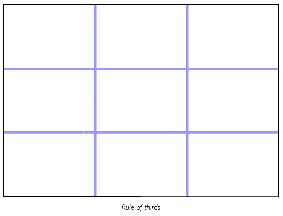
The rule of thirds.

Divide the two sides of the rectangle into three equal parts. The “hotspots” lie on the intersection lines.  Make sure that your point of focus is located at one of those four points.

rule of thirds

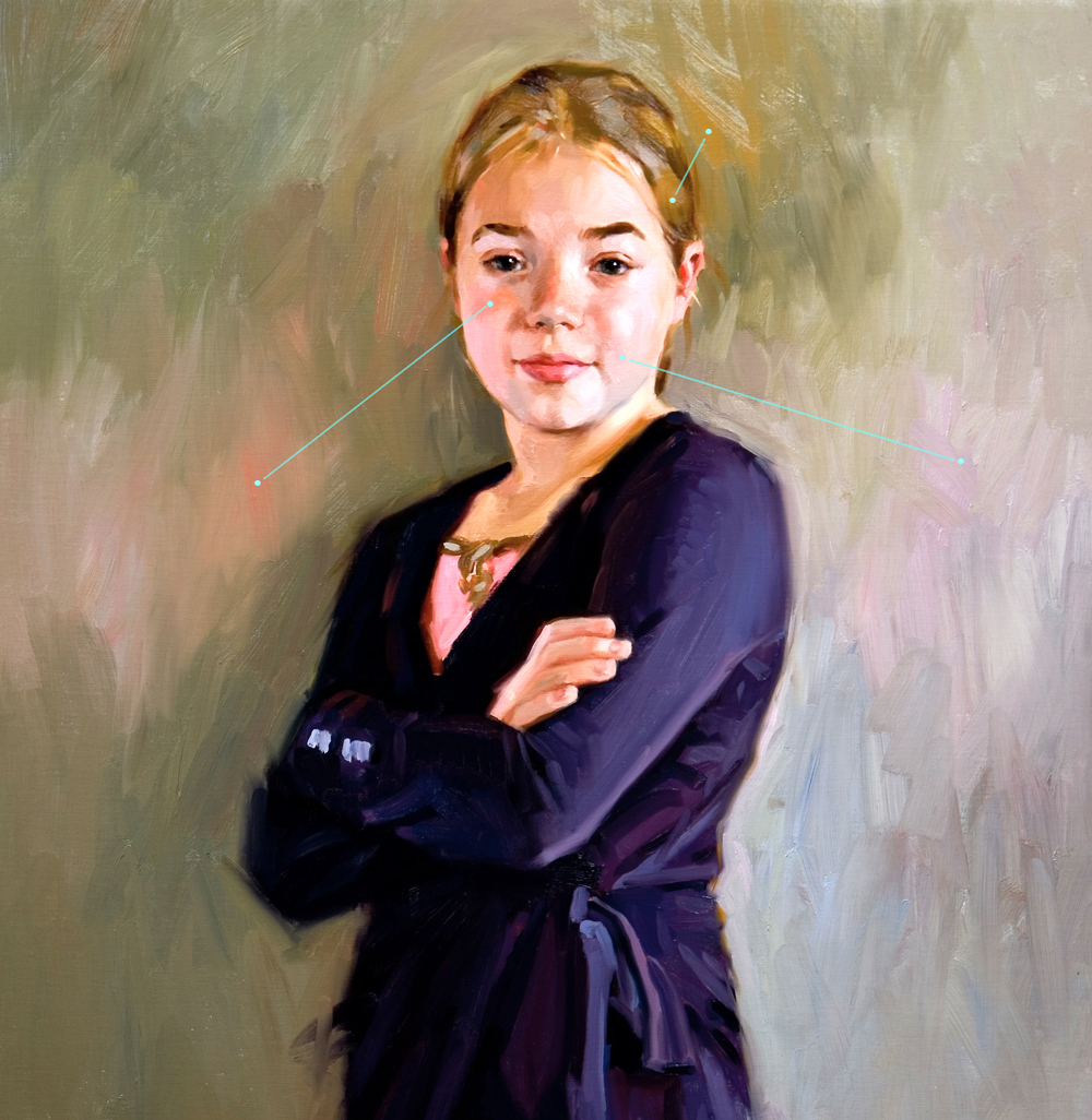
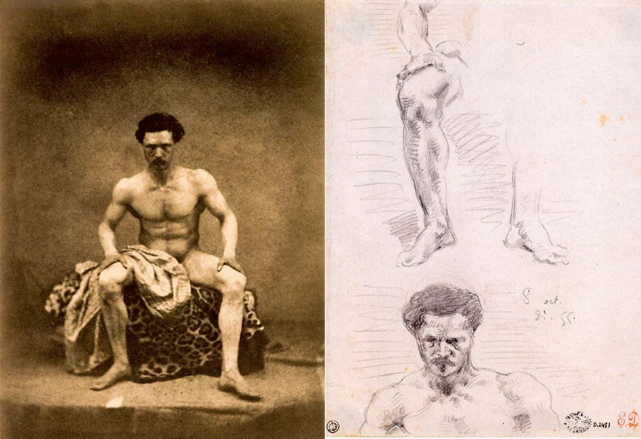
The armature of the rectangle. The formal subdivision.

Start with two diagonals and connect all points as show in the example. This armature provides the limits of the composition. Within these limits the composition can be varied. But where and how?formal subdivision

composition

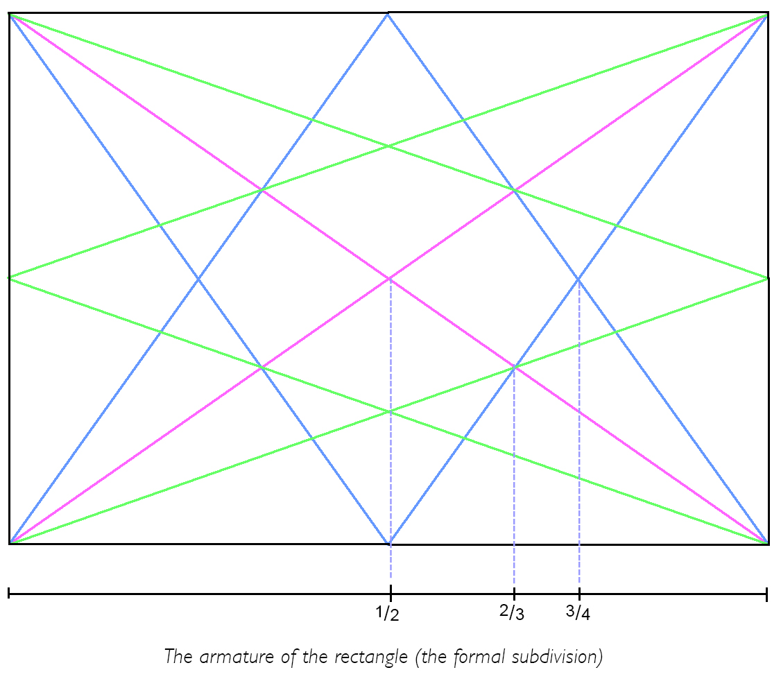
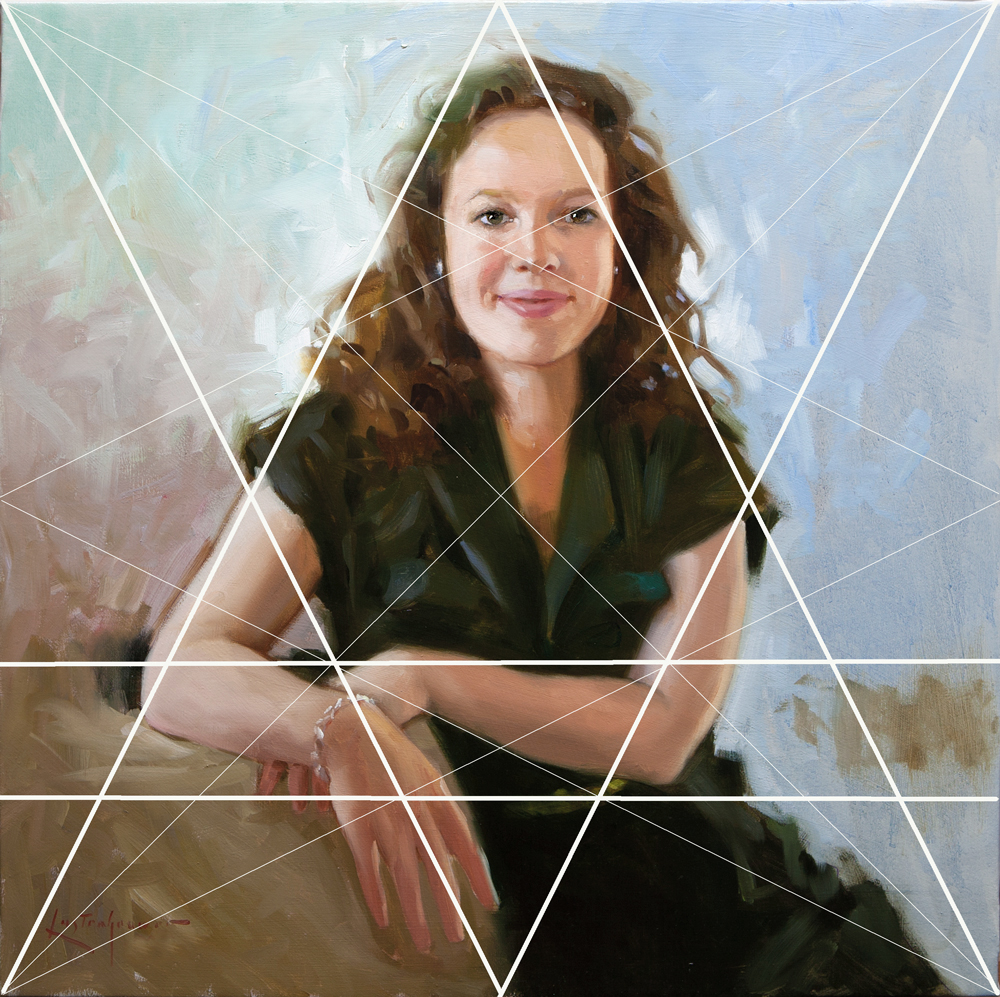
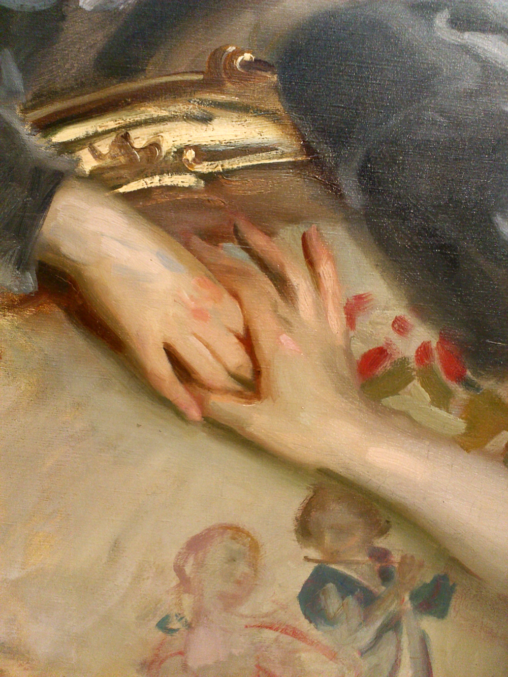
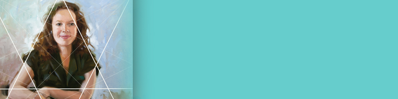
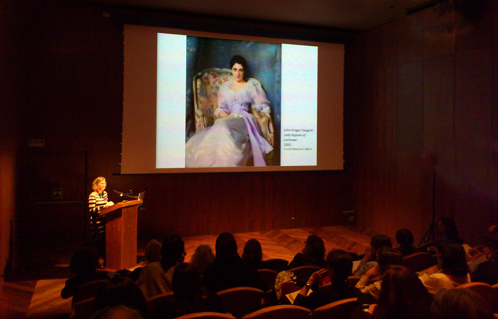
Look what I did with this portrait. I started the photography, at the client’s home, without having any idea of the composition. As always, I found my way while taking photographs. Later, when I made the sketch, I explored if I could capture the whole image in the armature of the rectangle. (In this case, the client wanted a square painting, but the theory is similar ) I added the emphasis on the right to strengthen the horizontal effect which starts at the model´s  arms. As simple as that is.  I liked the rhythm of the upper arms and also the left hand that follows one of the composition lines. The whole figure fits more or less in the triangle outline, from the top centre to the baseline.

Composition is an essential element in painting, and on the internet you can find an endless list of websites. The risk, however, is that you become dizzy with choice. Take what you like and forget the rest! 

Family Portrait

family portrait

Finally the family portrait is finished and it can be shipped to the gallery.  A major job and I really enjoyed the work. Like always the challenge was to get all four protagonists in a credible way on the canvas, engaged in the same moment in time. And of course, the resemblance had to be complete; the main criterion of commissioned work. On this matter I was in close contact with the client as usual, willing to listen carefully and if necessary making adjustments. I will miss the painting that has been for some month on my easel. Eventually everything leaves the studio.

American impressionism in Madrid (2)

american impressionism

Thyssen-Bornemisza American impressionism

I admit it: I had a prejudice against art historians. I would prefer to look for myself rather than listen to someone else talking about it. My stupid shortsightedness! Last Friday I attended the conference “American Impressionism”, organized by and at the Thyssen Bornemisza Museum in Madrid. I enjoyed tremendously the lectures and the expertise of the lecturers! The starting point of the conference was the influence of the French impressionism on the American art of the late 19th century. Continue reading “American impressionism in Madrid (2)”